Thursday, January 31, 2013

2011 Quest, positions coming into checkpoints

I went ahead and loaded checkpoint data from the 2011 Quest into a spreadsheet, available online here. I've got one "sheet" per checkpoint (see the tabs across the bottom of the page), and it's a big, slow honker.  Performance is one reason not to use spreadsheets for this sort of work; a database would scale better.  I'll be curious to see what happens during the Iditarod, which has 23 (or 24, depending on whether or not you include Willow) to the Quest's 14 (not including the start).

Once I had the data in a spreadsheet it was pretty trivial to rank arrival times per checkpoint and then turn that into a plot of the top 5 finishers' arrival positions over the course of the race:


I don't think it should come as a surprise that this looks far more chaotic and far less orderly than the plot from 2012.  A lot happened during the race and nearly half of the field scratched or were withdrawn.  Some of the problems faced by individual teams show up in the plot, including Brent's loss of dog on the way into Scroggie and Dallas and others running into dangerous overflow between Circle and Central.


Sebastian Schnuelle's boots in Central (c) Yukon Quest

In Mike Ellis's remarkable video from the race that year, he closes with "2011 Yukon Quest: our toughest, our slowest, our most rewarding!"  The real stories of the race are with mushers, and with what they tell us (or not) when it's over.  But sometimes, a good plot (which this isn't, but it's still revealing) can tell us something, or allow us to get a slightly different visual understanding of what happened.

In the meantime, stories from the trail at the 2011 finishers' banquet:


Tuesday, January 29, 2013

2012 Quest, position coming into checkpoints

Now that we've got the spreadsheet thing more-or-less licked, it's time to start actually dorking around with data to see if we can learn anything.  Initially I thought I'd look at one of this year's races, but with the Quest starting in less than a week I thought it might be fun to look at previous races.  I'm still getting the hang of the R statistical package, which provides both statistical analytic functions and some good (if slightly unattractive) graphics plotting functionality.

If you'll recall, last year's top 5 teams, in order, were:

  1. Hugh Neff
  2. Allen Moore
  3. Lance Mackey
  4. Jake Berkowitz
  5. Brent Sass

So, to start with something simple that won't reveal much but might recall what a squeaker last year was, I decided to take a look at positions coming into checkpoints.  The first team to arrive is in position 1, the second is in position 2, etc.  It also might demonstrate at which point in the race things started to firm up.  Remember that Two Rivers was the first checkpoint, so there hadn't been a lot of trail for teams to move into position.  Still, you might note that 1) two of the top 5 teams actually drift back a bit through the first few checkpoints, and 2) Brent came out hard but couldn't hang onto it (click on image to enlarge).


I may go back and look at previous years with the same question, but one thing I'm interested in examining over multiple years is whether or not there's something going on in the first half of the race that can have predictive value for the outcome.  In the meantime, if you've got questions that you think either plots or statistics can answer, let me know.

Sunday, January 27, 2013

New mounts for the SPOT trackers

Good morning from nippy Two Rivers, Alaska, where the thermometer on my front porch is reading -60F.  This seems like a good opportunity for a shout-out and a "Have a great run!" to Abbie West and Allen Moore, neighbors here in Two Rivers who will soon be leaving for Whitehorse to run this year's Quest.

As those who've been following the race know, there have been reliability issues around SPOT trackers during the race in the past, and people have been talking for some time about how best to mount them so that they'll stay on the sled if the sled barrel rolls or smacks into a large object, and so that there can't be plausible claims that someone accidentally turned off tracking or that a large sheet of aluminum dropped out of the sky and covered the antenna.  So race manager Alex Oleson has designed a SPOT tracker mount based on an original design by four-time Quest champion Hans Gatt, and the mount is now riveted to the sled on or near the brushbow.  Here's a photo of one mounted on rookie Rob Cooke's sled:


and a photo by Sebastian Schnuelle of one being drilled for mounting at the vet check yesterday in Whitehorse:


In the past, trackers have been put in booties and pinned to the front of the sled bag.  It hasn't always worked well (you may remember Hugh Neff losing his tracker coming off Eagle Summit) and there have been some issues with teams arriving at checkpoints with the trackers off.  This should be a big help.

Because of what I do for a living I've become wired to look at things and try to figure out what can go wrong or how to get around whatever protections they provide.  With the new mounts, aside from people being less than thrilled to have their sled drilled through, there may be a potential problem with the metal interfering with the radio in the SPOT 2 devices, which have had some reliability problems.  But overall this looks like a substantial improvement and I doubt there will be interference issues.

I'll be curious to see how they work out on the trail.

Saturday, January 26, 2013

Yukon Quest media coverage

The Yukon Quest is hands-down my favorite event in Alaska.  It's hard to believe that it starts in a week, but it does!  February 2nd.

Preparations are starting to get serious.  Up until now there's been a massive amount of working being done in the two offices (Fairbanks and Whitehorse) and by volunteers, but the public face has been fundraising and social events.  Last weekend, though, was food drop day and today was vet checks.  (Today was also the day that volunteers installed newly-designed SPOT tracker mounts on sleds; I'll have more on that later).  A week from today teams leave Whitehorse, drop onto the Yukon River, and start the thousand-mile run to Fairbanks.

So, media coverage.  It's started.  This post from last year is still pretty accurate, I think. In addition to those usual resources  Emily Schwing has started her coverage of the race on the Fairbanks public radio station, KUAC.  She'll be on the trail with the teams.  She's covered the race for several years previously and her experience with the race and personal familiarity with the mushers and their dogs is starting to make for some really interesting reporting.

Those who enjoyed last year's photographs and videos from the Quest media team will probably be interested in this project by two of its members, Scott Chesney and Mark Gillette, who are covering the race independently this year and will be producing - you got it - photos and videos.

You may have noticed a blogroll on the right-hand side of this page.  I'm in the process of updating it, with a focus on the kennels of people who are campaigning their dogs in distance races in the north (Alaska, Yukon, etc.).

Tidying up a little more

Okay, now that we've figured out how to copy the NL 300 leaderboard spreadsheets to a place where we can sort them and (hopefully) merge them into a set of data from multiple (or all!) checkpoints, we need to reformat them into something that we can do arithmetic on.  Note that in the best of all possible worlds the data will already be in a format you can use, and you'll be able to roll up your sleeves and go to town on race data immediately.  However, we don't live in the best of all possible worlds, and you've got to work with what you have, so here we are.

[Throughout I'm going to assume that you've got basic spreadsheet knowledge but aren't a hardcore spreadsheet jockey.  You know how to reference cells and do calculations based on cell contents (that is to say, you know to preface a calculation with a '=') but aren't necessarily familiar with some of the more obscure issues around formatting or with spreadsheet functions]

The first problem is that the time is represented in a 12-hour format rather than a 24-hour format, so that the spreadsheet doesn't know whether "2:00" is 2am or 2pm.  For the first checkpoint this is straightforward - everybody arrived after noon but before midnight, so we can add 12 hours to get to a 24-hour representation.  How do we do that?  With a formula, plus a little bit of information about data formats.

Any piece of data is just basically a bag of bits.  When a computer sees the bits 01000001 it doesn't know (or care) whether that's an ASCII 'A' or the decimal number 65 or hexadecimal 41, etc.  It's up to the software that manipulates and displays that set of bits to know and/or decide what it is and how to deal with it.  And so it is with spreadsheets that you often need to tell a spreadsheet what format is used in a given cell.  Google often guesses correctly, but not always.  It has a reasonably rich set of time formats (as well as some handy time functions) and you can do a surprising amount of work with not very much effort.

So, if you go to the format menu you'll be able to see some of your options for displaying times and dates:


However, Google is smart enough to guess that when it sees three sets of two digit numbers separated by colons, it should treat it as a time-formatted value.  And when you want to manipulate something that's formatted as time, you'll need to make sure your numbers are in the right format, too.

Here's an example: we want to add 12 hours to arrival time in Yentna, outbound.  The obvious thing to do would be to take a cell that has the time for a given musher and add 12, but the spreadsheet has no way to know 12 whats you want to add.  12 hours, 12 minutes, 12 seconds, ... ?  So here I'll add a column to the right of the arrival time column to hold the adjust time, and try some arithmetic:


So, that doesn't pass the smell test - that's obviously not useful.  Although, come to think of it, a world with a 291:00 o'clock might make it easier to get more done in a day.  Anyway, the way to fix this is to use the "time" function to tell the spreadsheet that you want to add 12 hours.  The time function takes three arguments: hours, minutes, and seconds.  And what we're going to do is add time(12,0,0) to the contents of column C (the arrival times).


And that, by golly is correct.  The next thing to do is to copy the contents of that cell and paste it into every cell in that column that has a musher in it.  The spreadsheet is smart enough to figure out that you want to reference a cell in that row and makes adjustments when you paste it in:


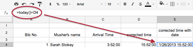
That's better!  But it's not perfect - in a multiday race, we need to know which day, too.  Let's start with an easy situation - teams were going in and out of the checkpoint today.  Let's add another column for our new date/time arrival times.  We're going to use the "today()" spreadsheet function to get today's date, and add our corrected times from the previous step (note that I've added some column headings so that I can keep track of what I'm doing):


And once again, we'll copy this formula and paste it into the other rows in the column to fill out the table.

But wait!  The mushers didn't arrive at the checkpoint today (Saturday), they arrived yesterday.  So here's how to add a specific date, rather than today.  Instead of using the today() function, do the same thing but use the date() function instead.  It takes three arguments in this order: year, month, day.  Here's how it looks when I add January 25, 2013:


So, that's pretty easy.  As usual, copy the contents of that cell and paste into the other rows.

The next post will show how to deal with figuring out if you've crossed into the next day, and how to deal with missing data.

Tidying up timing data for arithmetic

The Northern Lights 300 started yesterday.  Helen Hegener is handling web and social media for the race and put together some really nice Google spreadsheets for maintaining the data.  It's a frosty -45 this morning in Two Rivers, too cold to do much outdoor recreating, so I thought this might be a good opportunity to start playing around with some plots (charts) I've been thinking about.  Oftentimes graphics are the best way to bring out something interesting in the data.

However, when I look at the NL300 spreadsheets there are a few issues that need to be resolved before I can start plugging in the formulas to do the arithmetic:

  • times are represented as 12-hour numbers rather than as 24-hour numbers.  For example, 2:00 may mean either 2:00am or 2:00pm.  Ideally 2pm would be represented as 14:00, and the times need to be changed in the spreadsheet to be able to get correct arithmetic results
  • there are no dates - not a problem in short races but when teams are out overnight we need the dates, or possibly offsets ("day 1", "day 2", etc.) to be able to do the arithmetic.  If someone leaves a checkpoint at 11pm and arrives at the next checkpoint at 5am the next morning, 5:00 - 23:00 is going to produce unuseful results.
  • each checkpoint has its own spreadsheet, sorted by arrival time.  This is the correct way to show the data to fans but it means that it's more difficult to do arithmetic on runtimes between two checkpoints because mushers change rows between checkpoints
Fortunately some of these are soluble with relatively little typing.  For example, on that last point, we've got something for each musher that stays the same across checkpoint: bib number.  Names are not reliable because a single typo can cause a mismatch on the same person (to illustrate, during a previous race someone named "Matt" was written "Matt" at some checkpoints and "Mark" at others).

So, let's walk through this process:
  1. We assume you've got a spreadsheet containing the start times, which is pretty much by definition sorted by bib number already.  
  2. Create a new sheet or scratch area.  In Google spreadsheets, you'll see a plus sign in the lower left-hand corner of the page:


  3. Copy and paste the checkpoint data into the new sheet
  4. Delete the columns to the left of the bib number column.  You should get something that looks like this:


  5. Select all the rows containing mushers (i.e. exclude blank lines and header lines):


  6. Next, go to the data menu and select "Sort range ..."


  7. You'll get a pop-up dialogue box.  You want to sort by bib number.  If that's in column A, as it is here, click "Sort".  Otherwise change the sort-by column, then click the "Sort" button


  8. and there it is:


Now you can go ahead and play with the numbers.  I like to copy the arrival times into a spreadsheet that contains a summary of arrival and departure times, and do the arithmetic to calculate runtimes, layovers, etc.  In this case we can't do it until we fix the times so that they're on a 24-hour clock, which I'll cover in a subsequent post.  We also need to account for missing data (mushers who haven't arrived at a checkpoint yet), and I'll cover that as well.

Note, also, that this procedure can be used to sort a table on any column, so this is a handy way to get a quick handle on, say, departure times, when the table is sorted by arrival times, etc.

Monday, January 21, 2013

The Kusko

I have to apologize for not following the Kusko very closely.  We've got an IETF meeting coming up in six weeks and I'm juggling a big pile of documents (it keeps the dogs in kibble, and it's really interesting work).  So, I've been kind of distracted.  A couple of things to highlight, nevertheless:


  • About mid-way through the race one of the people handling their social media posted to their Facebook page that Rohn Buser was closing on Jeff King.  It was clear from the Trackleaders race flow chart that Jeff was actually opening up the gap on Rohn.  That race flow chart is a terrific tool.  I'd really like to see Trackleaders beef that up a bit, allowing us to choose which teams are shown on the chart, for example.
  • I think people may not have noticed that there's a replay button on the race tracking page, right under the map:


  • I have to confess that I don't think that the replay provides information that helps us understand the race better, but it does help capture some of the immediacy of the race as you watch teams pass and be passed, take breaks, and (of course) get lost.  I'd be extremely interested in what you all think about it.
  • I did start keeping my own spreadsheet on the race using the suggestions that Chris outlined here.  But as I looked at the Kusko leaderboard it was clear that they were using a spreadsheet, using it well, and producing results that we can feel confident about.  Best guess is that they were using Microsoft Excel and exporting HTML from it.
  • Nevertheless I do want to go back to the Copper Basin data and figure out what we can figure out about the race using some other visualizations.
  • Congratulations and much respect to Jeff King, who ran an excellent race.
Northern Lights 300 this weekend, people!  I'm really looking forward to it.  A sneak peek at how they're planning on presenting the data looks very promising.  So many Alaska races have had to cancel  or postpone this year because of poor trail conditions, which makes the ones that do come off all the more special, and all the more competitive.

[Yukon Quest is around the corner, too.  My consultancy is proud to sponsor a finisher bib.]

Saturday, January 19, 2013

A brief digression

Thank you thank you thank you, whoever came up with this:


That's right, caffeinated maple(-flavored) syrup.

Friday, January 18, 2013

Raise your glass


if you are wrong in all the right ways

I come from a technology culture in which it's taken as a given that if you aren't making mistakes it's probably because you're not actually doing anything.  Having someone else point them out is an opportunity to fix something broken, and make it better.  That's a very, very good thing.  I tend to work in environments in which a lot of people review my stuff and over the years I've come to see it as a big net positive when someone finds an error and I'm able to fix it before it propagates.

But, sometimes - too often, probably - I forget that the rest of the world tends not to operate like that and people regard having their mistakes identified as a personal affront.  I don't see it that way and in my post about errors in the Copper Basin data forgot that that's not the way most of the world works.  I screwed up by writing badly and not making that clear, and I apologize.

So here's the thing about the Copper Basin: like other races, by the end of the first night without sleep volunteers are tired, and by the second they're approaching burnout.  You've got revolving crews of volunteers at the checkpoints and different people have different ways of recording ins and outs.  Our experience with our own races has been that it's not uncommon to forget to record the number of dogs. Not everybody is equally good at arithmetic, and frankly arithmetic on times isn't very intuitive in the first place and can get downright confusing when you cross a day boundary.  Errors are inevitable.

Going forward from here, I'm interested in a couple of things:
  • good race data
  • the things you can do with good race data, and
  • making it easier for race organizations to deal with their data
The first thing is that people really are interested in your data.  Maybe not everybody, but I've been a little surprised to see that my spreadsheet from the Copper Basin is still seeing some use (I don't know by whom - the usage information is anonymized before I ever see it).  Inaccurate data are less useful, not only because they make it difficult to understand what's really going on but also because the more things are wrong, the more everything becomes suspicious.  You can't tell what's correct and what's not.

It's tempting to look at race timings as big piles of individual numbers, but there are stories buried in there that can be pulled out with some statistical analyses and with good summary graphics.  One of the reasons I'm such a fan of Trackleaders is that they are working hard to come up with new and better ways to reveal those stories to fans, whether it's the race flow chart or their (pretty bad, at least for dog mushing) projections.  I have a few things I'd like to try with the Copper Basin data when I get some time (that's becoming my theme song), which is why I care about the data quality.

Anyway, probably more immediate is the question of what can be done to make race volunteers' lives a lot easier while improving the data.  Improving the data at the cost of creating more work for the checkpoint and web staff is not an option, and making things easier for the volunteers by not showing any data, or permitting just really awful data, isn't a very attractive option.  But, there are a few things that can be done:
  • Create systems in which you only have to enter a given piece of data once.  A given piece of information, whether it's bib number, arrival time, number of dogs, whatever, shouldn't have to be retyped.  This suggests spreadsheets, databases, something to automate the process
  • Use calculators, particularly for time differences.  It may be a spreadsheet, it may be a smartphone app, it may be a website, but don't do any arithmetic that you don't have to do
    • To use spreadsheets, format arrival and departure time as number->time, and format the difference between them as hours.  Take a look at the format menu for your spreadsheet, although if you're using Microsoft Excel or OpenOffice you'll need to use the TEXT function.
    • A really excellent online resource for time arithmetic is the set of calculators at timeanddate.com.  You'll want this one.
    • As we know all too well, race checkpoints can often be in fairly remote places with no telecommunications or internet, so you won't be able to use web resources.  There are several date calculators available for free for smartphones, although I haven't tried any and would be loathe to recommend one.  If none are adequate it should be quite straightforward to put together something for iPhone and/or Android, since both offer nice time picker primitives.
  • I'll acknowledge right now that this is kind of a pain in the tuches, but sanity check your data.  There are some quick heuristics that you can do to identify potential problems and protect yourself from uploading funky data.  For example,
    • the number of dogs in a team should be the same for the departure from the previous checkpoint and the arrival at the current checkpoint.  If not, ask questions
    • without having to figure out what the actual difference is between 7:25am on 1/18/2013 and 11:23pm on 11/17/2013, you can look at the last digits in the times and see if what you get when you subtract them matches the last digit on the elapsed time calculation.  In this case, if it's not '2' you've got a problem
    • you can do the same with hours.  Even if you're not into carrying hours and days, you can get a sense for when a calculation is two or more hours off
Anyway, I'm really interested in helping to identify, and develop where necessary, tools to lighten volunteers' load, and incidentally produce more reliable results.  If you've got suggestions about what would make your life easier, definitely let me know.  In the meantime the Kuskokwim 300 just started, with some potentially dangerous weather starting to blow in.  The race is being tracked and Trackleaders has a new toytool that looks pretty interesting - a replay button.  More soon!

Monday, January 14, 2013

Experience using spreadsheets for Copper Basin 300

This weekend I've been using a Google Drive spreadsheet to follow the Copper Basin and do some basic calculations.  The spreadsheet is here.

So, a couple of observations:

  1. After about three checkpoints the single sheet approach dissolves into a very big mass of numbers, and it should be broken out in some form to make it more digestible.  Chris used a different strategy, and created sheets for each checkpoint.  It seems to me that doing that plus having a front sheet with summary statistics might be a good way to handle it.
  2. Using spreadsheets helps meet the goal of only having to enter a piece of data once, reducing both errors and effort
  3. Speaking of reducing errors and effort, having the spreadsheet calculate time differences, speed, etc. is an enormous win.  This can't be overemphasized
  4. However, if you're going to start calculating time differences and summary statistics, you probably need to be sophisticated enough to understand problems around missing data and how to cope with them.  Google spreadsheets and Excel have a basic "if then else" control structure that's easy to use if you're comfortable with lots of nested parentheses.  OpenOffice Sheet may, but I haven't looked at it 
  5. The rudimentary plotting stuff is helpful but you'll need a scratch space for the calculations.  I used a spare sheet that I just threw numbers into more-or-less willy-nilly.  When plotting histograms, etc. if you aren't able to reduce the data in some way you'll end up with a completely flat distribution, since it's rare that two teams are traveling at precisely the same speed.  So, using the "floor" and "frequency" functions I was able to group speeds by half-mph increments and plot those.  I didn't love the results but I think they can be improved a lot and may end up being useful.  Dunno, though.
  6. It is possible to provide multiple views into the data; for example display the musher stats for a checkpoint or checkpoint stats for a musher.  At some point, though, the spreadsheet turns into a big hairball and it becomes hard to understand the relationships and dependencies between sheets and cells, and in the long run it might be better to have better software that's written specifically for dogsled races
  7. Having something handles the arithmetic easily allows us to display a wider range of summary statistics and provide more information about how the race is playing out.  A lot of people are interested in those summary statistics but not everybody is, and it's important not to allow the analytical tables to clutter up the basic display and make it harder to read.
Jodi Bailey made some good suggestions on my Facebook page:
 I like the accumulated rest & average speed columns. I am thinking the plots show how many mushers were in each speed zone [ ... ].  Might be more interesting if you could plot mushers on it? Is that possible, may get busy looking. Also would love if the sheet could be sorted by current standings? Which would let people see that being high in the standings early on does not always reflect speed or rest time, which have a big impact. And maybe a simple check box for when a differential has been paid back to the clock, cause if that is calculated in rest it gets confusing on minimum mandatory rest races. (my 2 cents)
So, now that I've got a big pile of data, here's an opportunity to try a few things out, see what works well, see what's unnecessarily complicated, and try to understand what's involved in adapting it for different races.   I'd be really interested in hearing what people think about the spreadsheet that's there, and what they'd like to see be done differently.  (And, as always, let me know about any errors you find.)

Sunday, January 13, 2013

Connectivity

It's a race weekend here in Alaska, with the big one being the Copper Basin 300.  It bills itself as the toughest 300 miles in Alaska, and it's lived up to that in the past.  It was actually cancelled because of the lack of a race board, then they were able to get a group together in the fall to make the race happen. Some things are falling through the cracks, notably timely race updates and accurate data.  

I think it is not sufficiently well-appreciated in Alaska that distance dogsled racing has acquired an international fan base and that there are a lot of people out there hanging on race updates.  For whatever reason, keeping the data flowing does not seem to be a priority.  We've seen it in a few races and we're seeing it in spades with the CB300, with the added problem of incorrect times and a lot of arithmetic mistakes.

At some point I'll post about using spreadsheets to handle race data.  There's absolutely no reason to do the arithmetic by hand, and spreadsheets have a surprising range of functionality, from time-based calculations to summary statistics to plotting data.  There are a few tricks I'd like to write about.  But ... the CB300 is clearly doing it the hard way.  And the slow way.

Anyway, there have been questions about network connectivity at Copper Basin checkpoints.  I have no idea, but I'm not sure people are fully aware of the options available to them.  This is the main thing to remember: 

You can frequently get wireless SMS messages out when you can't make phone calls or connect to the internet

It was also race weekend here in Two Rivers, with our postponed Solstice 100 finally taking place.  What we found worked extremely well was to have someone in a location with good connectivity updating our online spreadsheets, and someone at the checkpoint sending email or SMS text messages when a team arrived or left.  This is obviously not an option when you've got no connectivity at all (this is where ham radio or a satellite phone might be a way to go), but it became pretty clear pretty quickly that relaying the data out to someone with good internet connectivity works extremely well.

Tuesday, January 8, 2013

Who what where when why

(or just what, where, and when)  Event organizers!  Your websites and Facebook pages are how you communicate with mushers and fans.  Put basic information about the race on the home page or in your Facebook about box.

Finding out when and where your race is taking place should be easy.


WHAT, WHEN, WHERE


Thank you.

Sunday, January 6, 2013

Race tracking and personal trackers

As I've discussed before, one of the things that's transformed distance mushing into a spectator sport and expanded the fan base is the availability of near-real-time race tracking by services like IonEarth and Trackleaders.  People love to watch their favorite teams move down the trail, see where they are in relation to other teams, and understand the drama of a dogsled race in a way that wasn't really possible before.  They can watch passes, they can make inferences about strategy from things like run/rest schedules, and they can see teams approaching checkpoints.  This makes race websites "sticky" - fans either park on the site for a long time when they anticipate something important is about to happen, or they just keep checking back frequently through the day.  This engagement can translate into various sorts of support for the race, and particularly into financial support (buy a mile programs seem to do well, tchatchke sales, etc.).

Not every race provides tracking services.  It's not free and it requires volunteer effort to mount trackers on sleds, reset tracking devices, etc.  It can be seen to be more trouble than it's worth, even acknowledging how it engages fans.  But as the price of the devices has dropped and tracking becomes more "normal," more and more dog teams are buying their own trackers and making their tracking pages public (see Brent Sass, Jake Berkowitz, Paige Drobny and Cody Strathe, and Kristy Berington, among others).  Fans love watching teams out on epic training runs, or just puttering around the neighborhood.

One of the things that's happened in several races in the past year, notably the TOTW 350, is that a team will carry a personally-owned tracker in an untracked race, and announce it to fans.  It's not at all the same as having a real tracking service for the race, since it doesn't show where other teams are or provide the analytical tools we've come to depend on.  But still, people watch those individual trackers, and during the TOTW I was surprised to find how closely they watch those trackers.

There was some confusion about start differentials and earliest leave-by times out of Chicken.  I'm not sure that anybody would have noticed except that several people saw Jake's tracker on the move before his earliest departure time, and started asking questions.  I ran through the earliest departure times listed on the TOTW website and found that they didn't match what was in the rules, and in particular nearly every team was listed as leaving 4 minutes later than they should, except for Jake, who was shown with an extra 16 minutes on his departure time.  If what was on the website matched what was going on in Chicken, he would have had an unearned 12-minute penalty.  Fortunately the website did not reflect what was happening in Chicken, and it was by all accounts a very fair race with no grievances filed.  (Actually, it sounds like it was a wonderfully-run, happy race that was enjoyed enormously by participants; see Mike Ellis's beautiful account here and Jodi Bailey's here).

It may be tempting for races who've made the decision not to put trackers on sleds to ban the use of personal trackers during a race, so if there is this sort of inconsistency it will go unnoticed and they won't have to answer questions about it.  I really hope they don't.  I think one of the takeaways from fan interaction with Jake's tracker in the TOTW 350 is that fans love the tracking services.  They watch them carefully, discuss them with other friends, and spend a lot more time actively following a race than they otherwise might.  I also think it's important to have fans supporting individual mushers, providing sponsorships, buying kennel memorabilia, and generally making it possible for teams to be able to afford the cost of running races in the first place.  It would be great if all distance races could provide online tracking services, but even if they can't personal trackers have a place in helping promote races and dog teams.

Tuesday, January 1, 2013

So here's an idea ...

It's often the case that race organizers drop the ball on communication once a race is over, leaving remote fans wondering what's going on, and occasionally frustrated.  A lot of us were looking forward to hearing from the TOTW why Mikhail Telpin had incurred what appeared to be a three-hour penalty, and why it disappeared when it did.  Someone in Tok posted a brief reference to adjusted times, but they weren't reflected on the race stats page nor was more information posted to the Facebook page.  We never learned who won which awards at the banquet, nor did we learn who won the raffle drawings.

Keeping the communication flowing during a distance race is a 24-hour job, and it's exhausting and frustrating.  By the time the last musher has come in, the volunteers are fried.  So here's a suggestion:  Why not designate one volunteer as the person to handle post-race communication?  Don't ask them to do much, if anything, during the race, but once the last musher is in it becomes their responsibility to handle social media, and possibly website updates.  It would be excellent to find a way to keep communication open without abusing volunteers' good will, and this seems like it could be a reasonable option.