Once I had the data in a spreadsheet it was pretty trivial to rank arrival times per checkpoint and then turn that into a plot of the top 5 finishers' arrival positions over the course of the race:

I don't think it should come as a surprise that this looks far more chaotic and far less orderly than the plot from 2012. A lot happened during the race and nearly half of the field scratched or were withdrawn. Some of the problems faced by individual teams show up in the plot, including Brent's loss of dog on the way into Scroggie and Dallas and others running into dangerous overflow between Circle and Central.
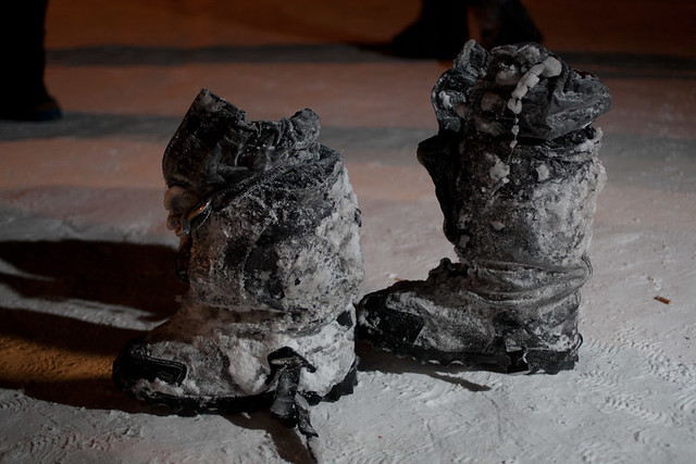 |
| Sebastian Schnuelle's boots in Central (c) Yukon Quest |
In Mike Ellis's remarkable video from the race that year, he closes with "2011 Yukon Quest: our toughest, our slowest, our most rewarding!" The real stories of the race are with mushers, and with what they tell us (or not) when it's over. But sometimes, a good plot (which this isn't, but it's still revealing) can tell us something, or allow us to get a slightly different visual understanding of what happened.
In the meantime, stories from the trail at the 2011 finishers' banquet:
No comments:
Post a Comment